Interaktionstillstånd
Interaction states are visual representations used to communicate the status of an element.

A loading state communicates the content of the element has not fully loaded yet.

A disabled state communicates when a component or element isn’t interactive.

An enabled state communicates an interactive element.

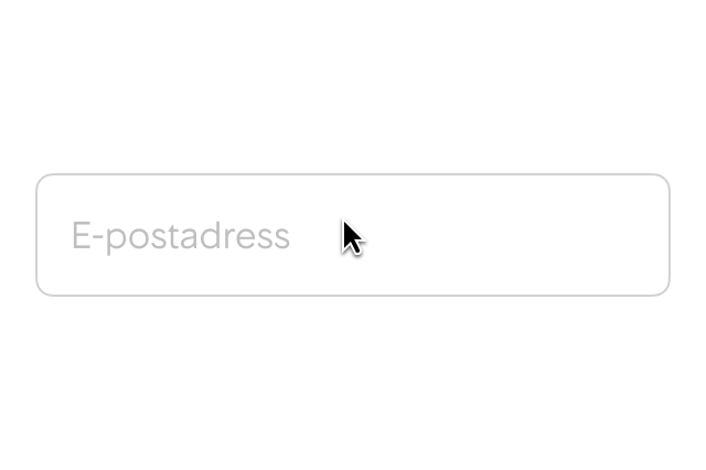
A hover state communicates when a user has placed a cursor above an interactive element.

A pressed state communicates a user tap.

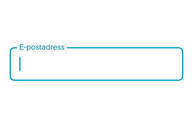
A focus visible state communicates when an element matches the :focus pseudo-class and the user agent determines via heuristics that the focus should be made evident on the element.

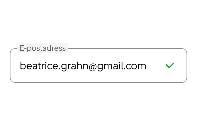
A success state communicates a correct user input.

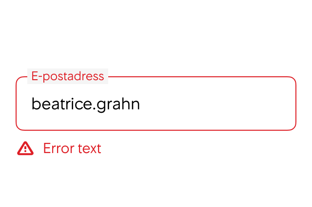
An error state communicates a user or system mistake.

An activated state communicates a highlighted destination, whether initiated by the user or by default.
In most cases the correct focus indicators are set automatically but there might be instances when you need to set focus-visible styles manually. For example, if there are elements or components that need to be able to recieve focus and they are used within a container that has overflow set to hidden or scroll. There are two mixins in the theme that can help you with this:
/**
* Mixin function for focus-visible styles.
*
* @param inset               Boolean. Set this to true when the element is inside a container with `overflow: hidden`
*                            to make sure that the focus outline is sufficiently visible.
* @param isForTextFieldLike  Boolean. Set this to true if the element is a text field or similar (like TextFieldButton for example).
* */

...theme.mixins.focusVisibleStyles()

/**
* Mixin to reset the styles set by focusVisibleStyles. Usable for example when you want an element to have
* focus styles, but not the focused element itself. This is not a function, it just returns a CSSProperties object.
* */

...theme.mixins.focusResetStyles